“There is always power in love. Love should cover the world.”
– Robert Indiana
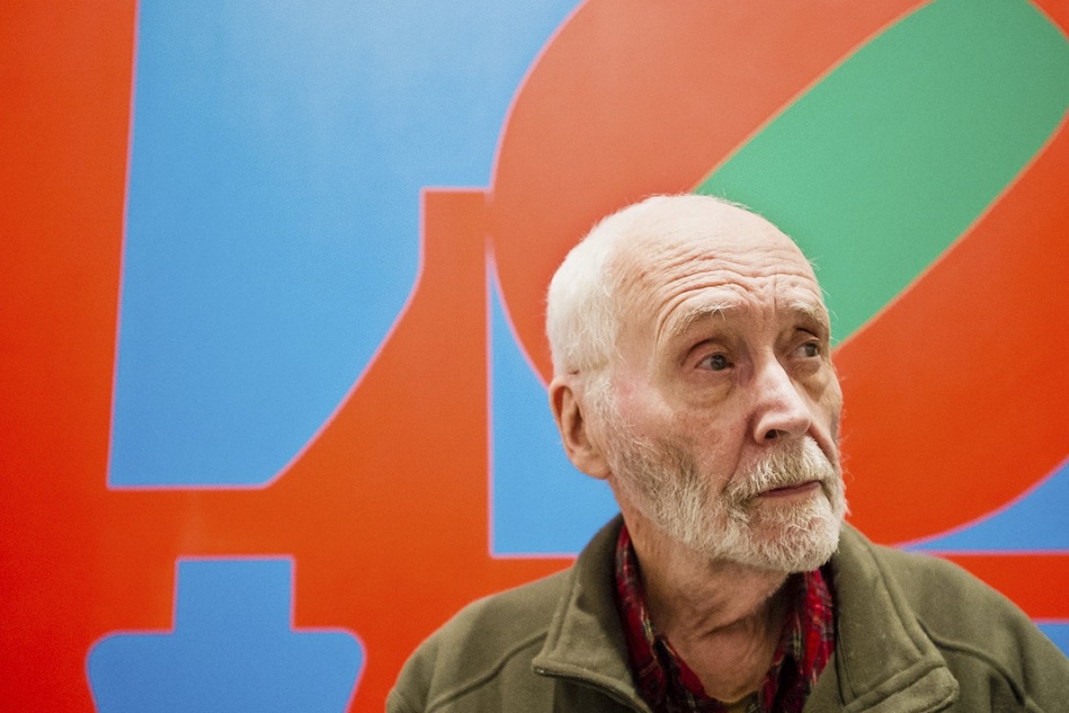
Robert Indiana at New York’s Whitney Museum of American Art | Image courtesy of AP
Robert Indiana is one of the major figures in American art scene during 1960s, self proclaiming himself as “American painter of signs”. He is professional in painting and sculpture, taking an important role in the development of assemblage art, hard-edge painting and pop art.
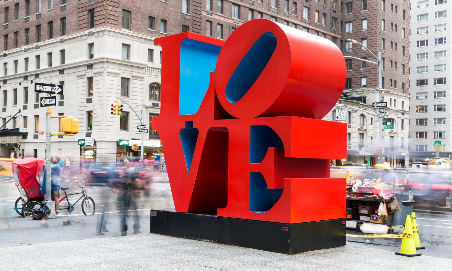
obert Indiana‘s Love sculpture in New York |
Image courtesy of Elizabeth Wake/Alamy Stock Photo
Growing up in the Great Depression
Robert Indiana, born Robert Clark, was born in 1928 in New Castle, Indiana, United States. Growing up in the Great Depression during childhood, he moved 21 times with adoptive parents before 17 years old. In 1942, Indiana moved to Indianapolis for his studies in Arsenal Technical High School. After graduation, he joined the U.S. Air Force and then studied at the Art institute of Chicago. In 1953, Indiana obtained scholarship and studied in the Skowhegan School of Painting and Sculpture in Maine. Scholarships also took him to study in Edinburgh College of Art at University of Edinburgh. During his studies in Edinburgh, the main activity was to study botany and write poetry which he set in type and printed by hand. In 1954, Indiana returned to the United States and settled in New York for developing his career. While working in an art supply store, Indiana was experimenting figurative work with expressionist.
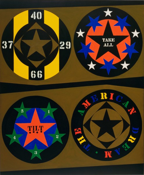
Robert Indiana, The American Dream, l (1960-1961), Museum of Modern Art, New York, Larry Aldrich Foundation Fund, 1961 | Image courtesy of The Museum of Modern Art / Licensed by Scala/Art Resource, NY
From Clark to Indiana
In 1958, Indiana changed his family name from Clark to Indiana – his birthplace, and avoid confusion with two other artists called Robert Clark. In the early 1960s, his career began to gain momentum. In “Art of Assemblage”, his exhibition in the Museum of Modern Art in 1961, he started gaining recognition. “The American Dream #1”, one of his paintings, was purchased and collected by the Museum of Modern Art. In the same year, Indiana had his first solo show at the Stable Gallery.
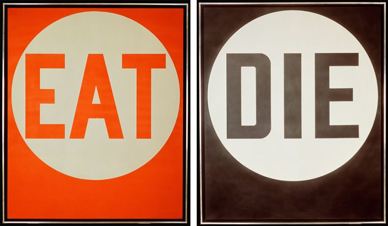
Robert Indiana, EAT/DIE (1962) | Image courtesy of 2019 Morgan Art Foundation / Artists Rights Society (ARS), NY
During that period, he started creating a series of single-word paintings in sans-serif, which issued short commands such as eat, die and love. In 1964, Indiana accepted an invitation to design a new work for New York City and to be shown at the New York State Pavilion in the New York World’s Fair. 20 ft EAT sign with flashing lights and the shot of Indiana slowly ate a mushroom for 45 minutes in Andy Warhol’s film Eat.
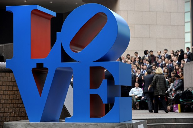
Robert Indiana‘s Love sculpture in Hong Kong in 2008 | Image courtesy of AFP
Indiana and LOVE
Indiana has been exploring the subject of love in his paintings. He thought that there is always power in love and love should cover the world. Indiana’s LOVE design in 1966 made him famous and became an iconic symbol. This design has been rendered in various formats, ranging from prints, paintings, sculptures, banners, rings, tapestries and stamps, as well as in a variety of colors, compositions, and techniques around the world. It has also been translated from English (LOVE) to Hebrew (AHAVA), Spanish (AMOR) and Chinese (爱).
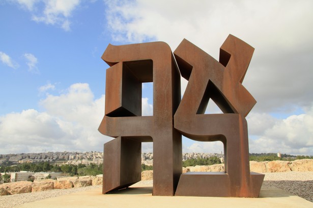
Ahava/Love (1977) by Robert Indiana at the Billy Rose Art Garden in Jerusalem, Israel |
Image courtesy of Alamy
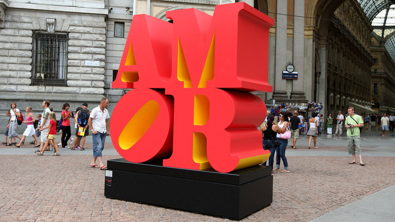
AMOR/Love (2008) by Robert Indiana at Piazza della Scala in Milan, Italy |
Image courtesy of Vittorio Zunino Celotto / Getty Images
The Birth of LOVE
The inspiration of LOVE image came from Indiana’s experience in church during his childhood. “God is love”, one of the most impressive gold inscription to Indiana, was over the platform where the readers conduct the service in a Christian Science church. His first LOVE was originally designed as a Christmas card commissioned by The Museum of Modern Art in 1965.
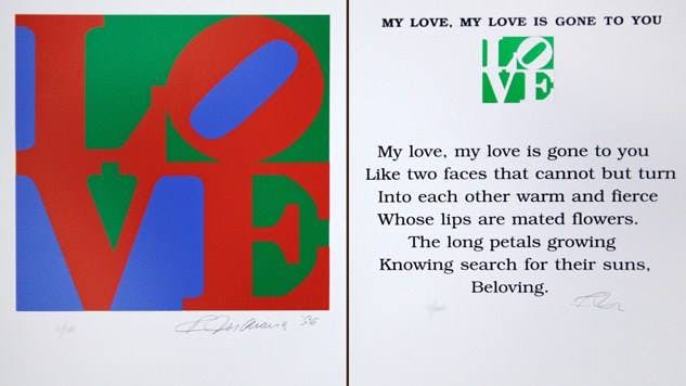
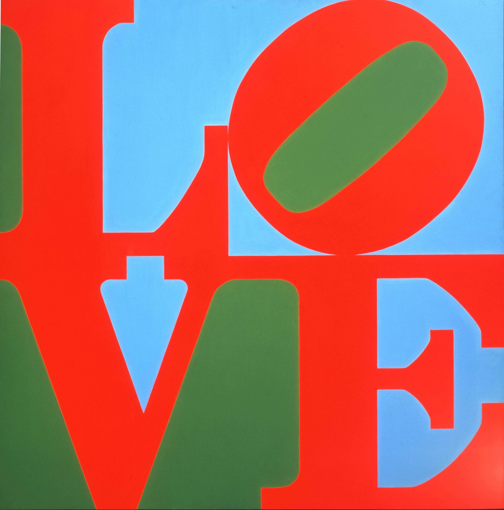
Robert Indiana, LOVE (1966), Indianapolis Museum of Art at Newfields, James E. Roberts Fund | Image courtesy of 2019 Morgan Art Foundation / Artists Rights Society (ARS), NY
The original image of LOVE was green and blue spaces backing and red lettering in bold Didone type. Didone is a genre of serif typeface emerged in the late 18th century and the standard style of general-purpose printing during the 19th century. The original edition was a tribute to his father who died at the end of 1965. The red and green recalled the sign of the Phillips 66, the logo of the oil company his father worked for. It also recalled Indiana’s childhood memory, one of the most impressive visual objects for Indiana. Blue and green can be associated with Ellsworth Kelly, the abstract painter whose most recognizable colors in his work are blue and green. Indiana and Kelly met in the art supply store. Kelly helped him to look for a studio. Later they developed an intimate relationship.
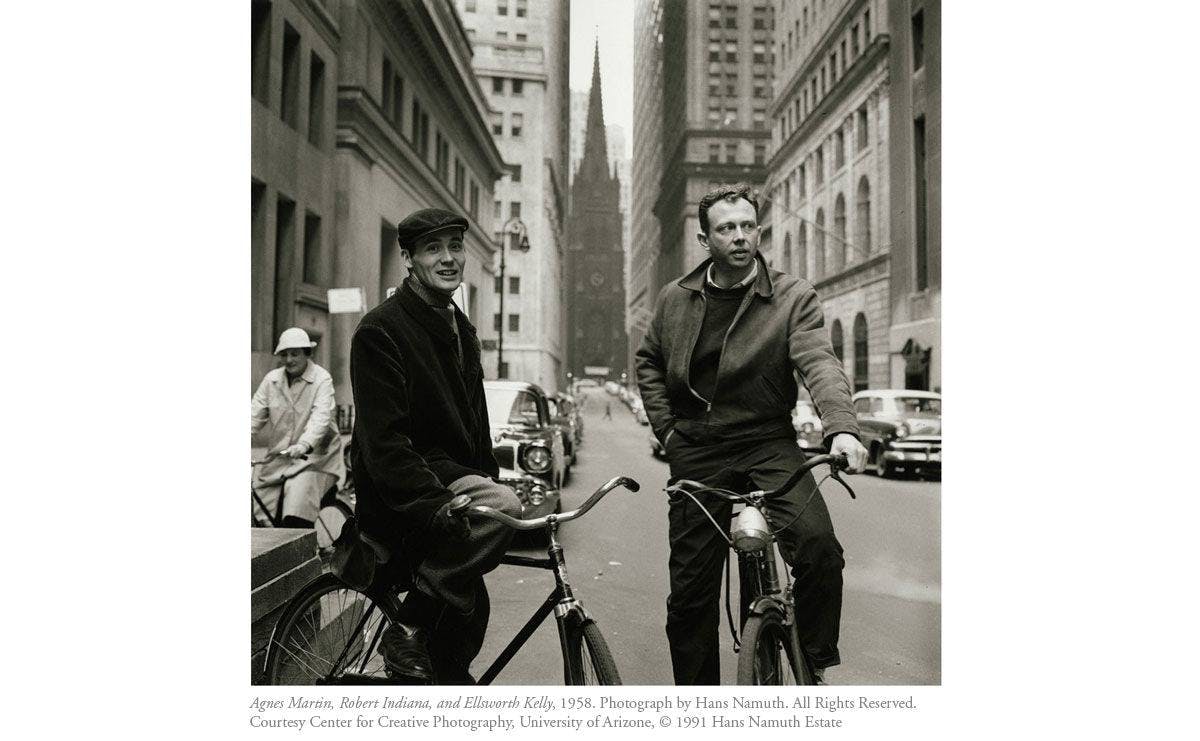
Agens, Martin, Robert Indiana, and Ellsworth Kelly, 1958. Photograph by Hans Namuth |Image Courtesy of Center for Creative Photography, University of Arizone.
LOVE‘s original rendering in sculpture was made in 1970 with COR-TEN steel, corrosion resistance and tensile strength material, exhibited in the Indianapolis Museum of Art.
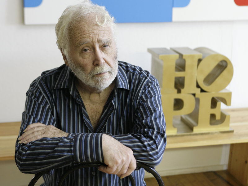
Robert Indiana in his studio in Vinalhaven, Maine in 2008 | Image courtesy of Joel Page/AP
Indiana later chose to remove himself from the New York art scene in 1978 and settled on the remote island of Vinalhaven in Maine with setting up a new studio till he died in 2018, at the age of 89.

